Company: Ralis Services
Role: Senior UI/UX Designer and Front-End Developer
Role: Senior UI/UX Designer and Front-End Developer
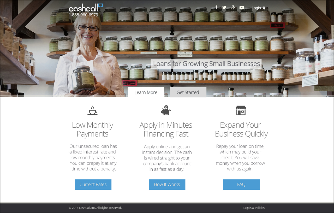
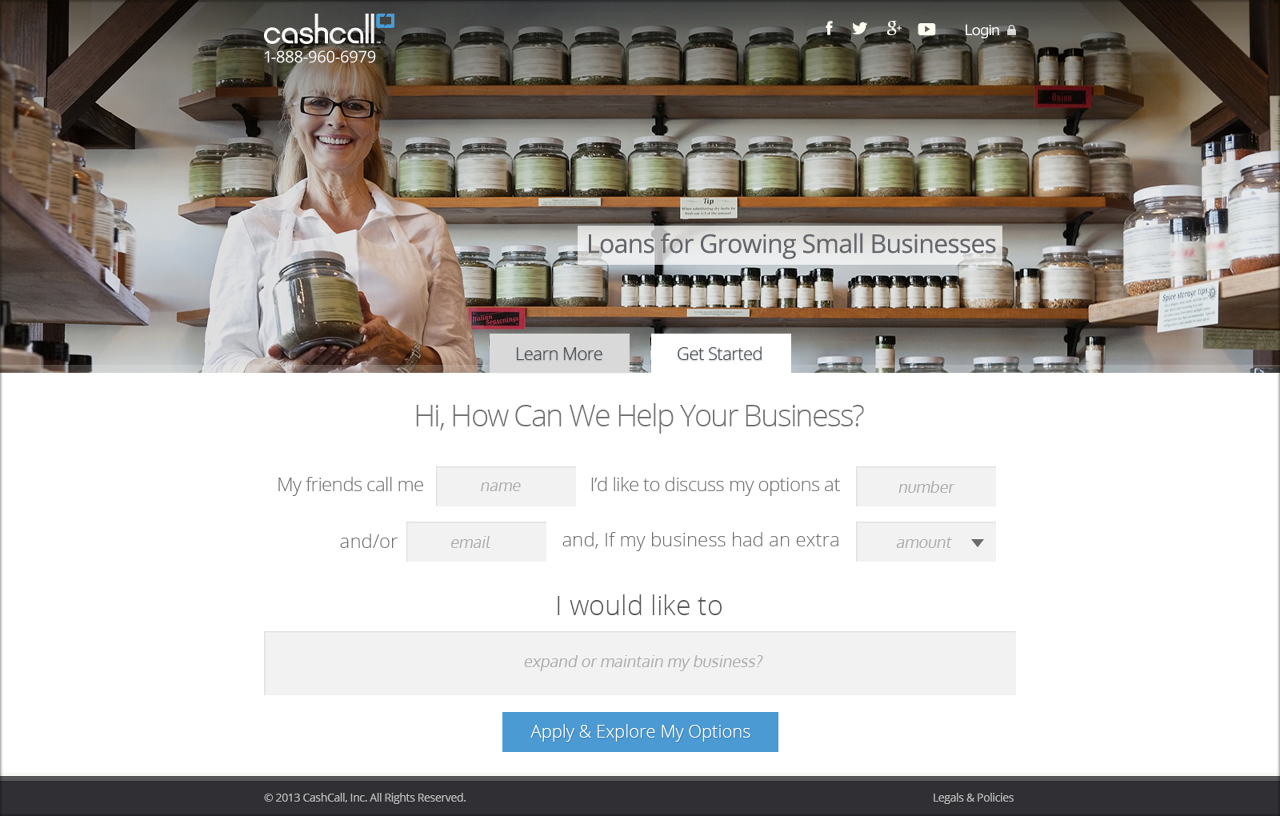
As the Sr. UI/UX Designer for Ralis Services, I was part of an initiative to rebrand CashCall, Inc. as a technology company, shifting its focus from customer service oriented sales and transactions to online and mobile user experience and interaction.
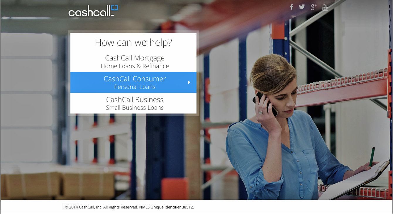
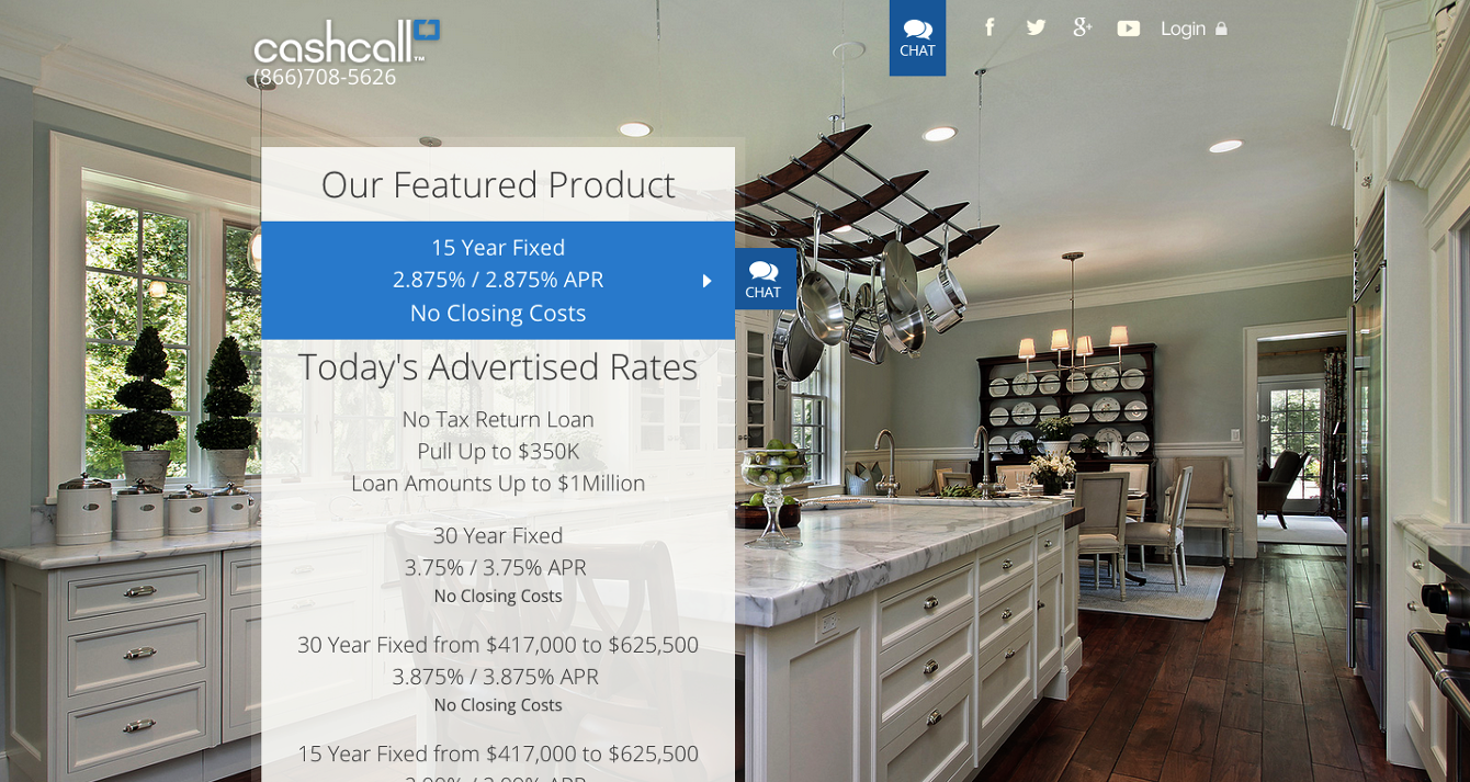
It was conceived to be a two-phase process. The first was a complete visual refresh that kept all existing pages, content, and back-end code the same, but gave their websites an entirely new look and feel.
CashCall's outdated websites previously had a bounce rate of 70%, and within the launch of our phase one site, the bounce rate dropped to less than 20% and conversions steadily increased.
As a hybrid UX/UI designer and front-end developer, I redesigned the websites as well as developed the front-end build, contributing to production code.
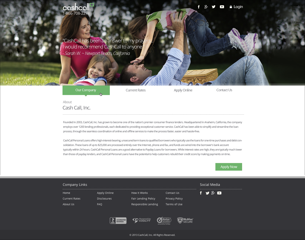
Working as the lead designer and front-end developer, I designed and built a suite of features and sites, some of which involved animations, rotating banners, and progress bars. I designed and integrated a new lead form that approaches the application process in an engaging and personal matter.
I also designed from product conception to delivery a suite of mobile and tablet applications with CashCall's entities and partnerships, including major entertainment networks.
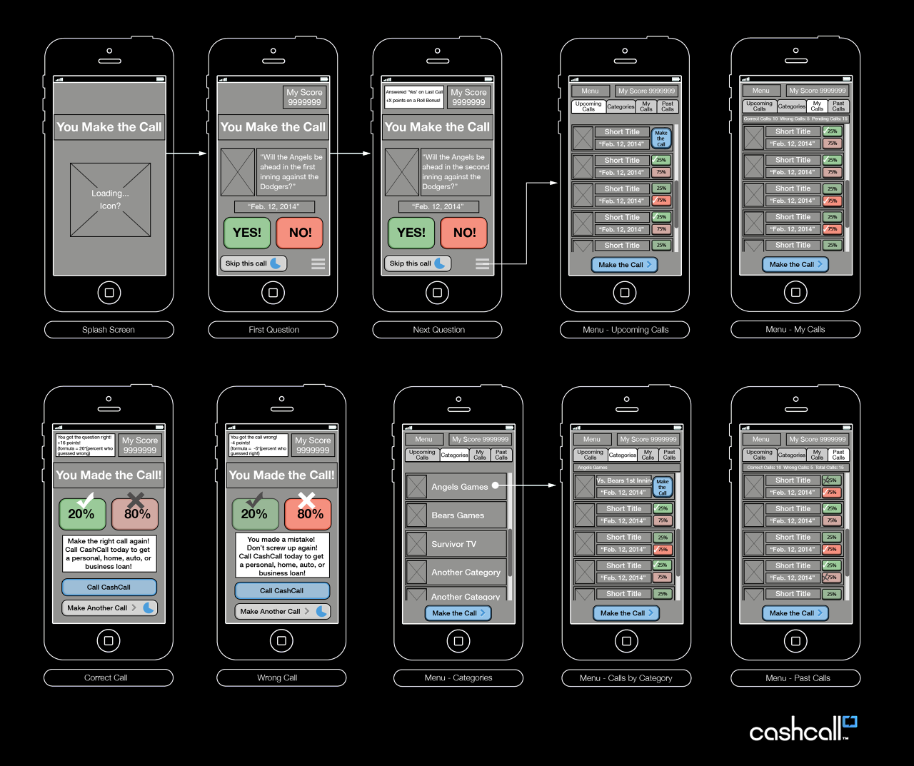
I designed websites, product features, and only spaces for the company, their entities, and affiliates. I worked on a myriad of mobile / tablet application projects through the full-gamut of the design process from conception, wireframes, user flow / interaction, visual design, user interface, and user experience to delivery.
Tools of the trade involved advanced knowledge of Adobe CS Suite (Photoshop, Illustrator, InDesign, Fireworks) and Axure as a high-fidelity, rapid prototyping tool.
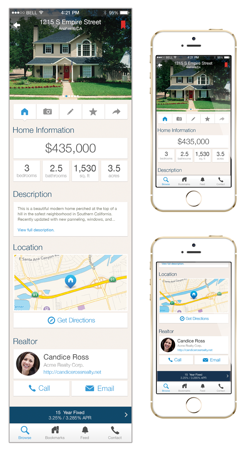
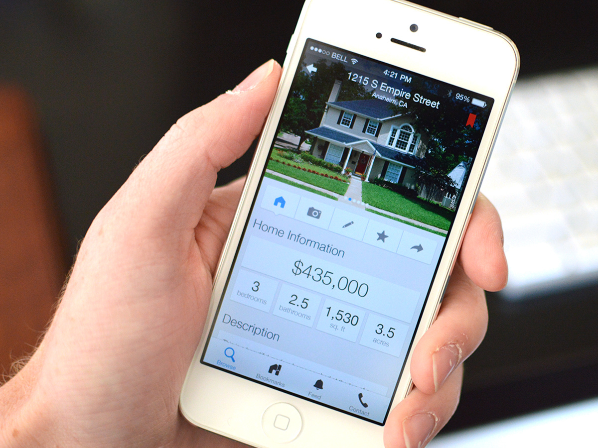
This is a home information screen for a home buying application scheduled for launch for iOS and Android the first quarter of 2014.

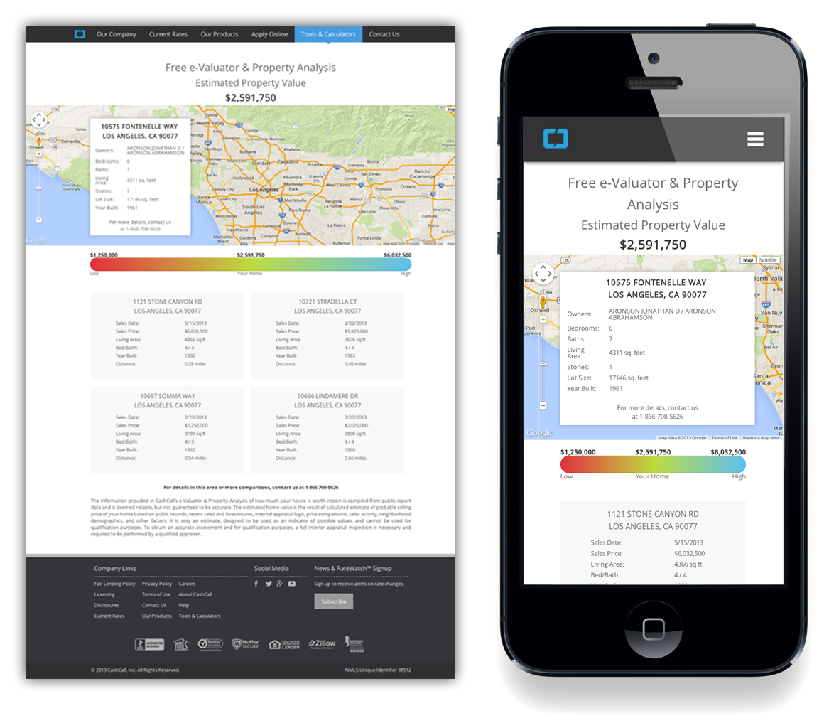
I also used a grid framework to code responsiveness into existing web pages for CashCall, Inc. so that the same design scales down from desktop to tablet to mobile. This is a page I designed and created for our free financial fitness / information tools.
Front-End Development:
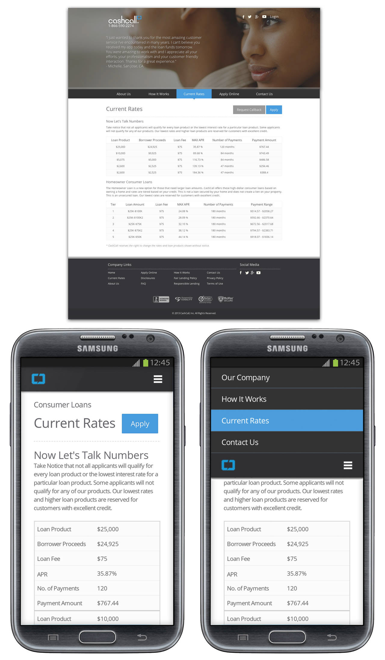
The screenshots above for the CashCall consumer site phase 1 reskin project are not meant to be representative of my design skills; rather, it's another example of responsive design that I built to restructure table data for mobile-friendly readability.
The data within the table is dynamic content that I restructured for mobile without touching or injecting classes into the HTML. The mobile version features the exact same table as the desktop site—it only has media queries applied to it so when the screen is too narrow, it reformats to make each row a bit like its table, and then stacks the information. (I added new subject headers for reach row via CSS alone.) This makes for much more repetition and vertical space needed but it fits within the horizontal space, so only natural vertical scrolling is needed to explore the data. For a smaller screen, it makes more visual sense than scaling the entire table down to fit the width of a mobile browser.
When I joined the Ralis Services creative team as their Sr. UI/UX designer, I entered their phase 1 reskin project for their client while it was already in process. Asked to create a navigational solution within the bounds of the current front-end build and design, I created a persistent primary navigation bar that docks and becomes fixed to the top of the page upon scroll and then unsticks when the user scrolls back up past the nav bar.
I also made the navigation responsive using CSS3 media queries and a little jQuery to display it in a small screen size properly. The navigation shifts into a condensed menu on a mobile browser and upon tapping the nav icon, the menu bar shifts down, revealing the main navigational elements above it and the current section the user is on.
For our phase 2 redesign project (the first kept all the back-end code and the content on each page exactly the same and merely gave it a new look and feel), I build a grid framework in SASS that, per specifications, has a fixed 960px max-width, is fluid and responsive, and supports a 12 column layout with content-specific classes as well as nested grids. I put in a function that takes in a list of element widths and decorates the children with the appropriate widths and column spacing from the margin to make structuring content sizes as easy as possible while making the code easier to read overall.
I decreased bounce rates from 70% to less than 20% upon launch,
increased conversions, and built a custom grid framework.