Company: StudyMode
Role: Senior Interaction Designer
I was contacted to conceptualize and quickly execute the visuals and UI flow for product exploration in Wolfram Alpha's answer engine.
I took a design that only allowed one input per page and expanded the user interaction, while addressing usability and the success of the page. I was allowed to break away from their design language and make it appealing yet credible to high school and college students.
Screenshot of current Wolfram Alpha Interface:
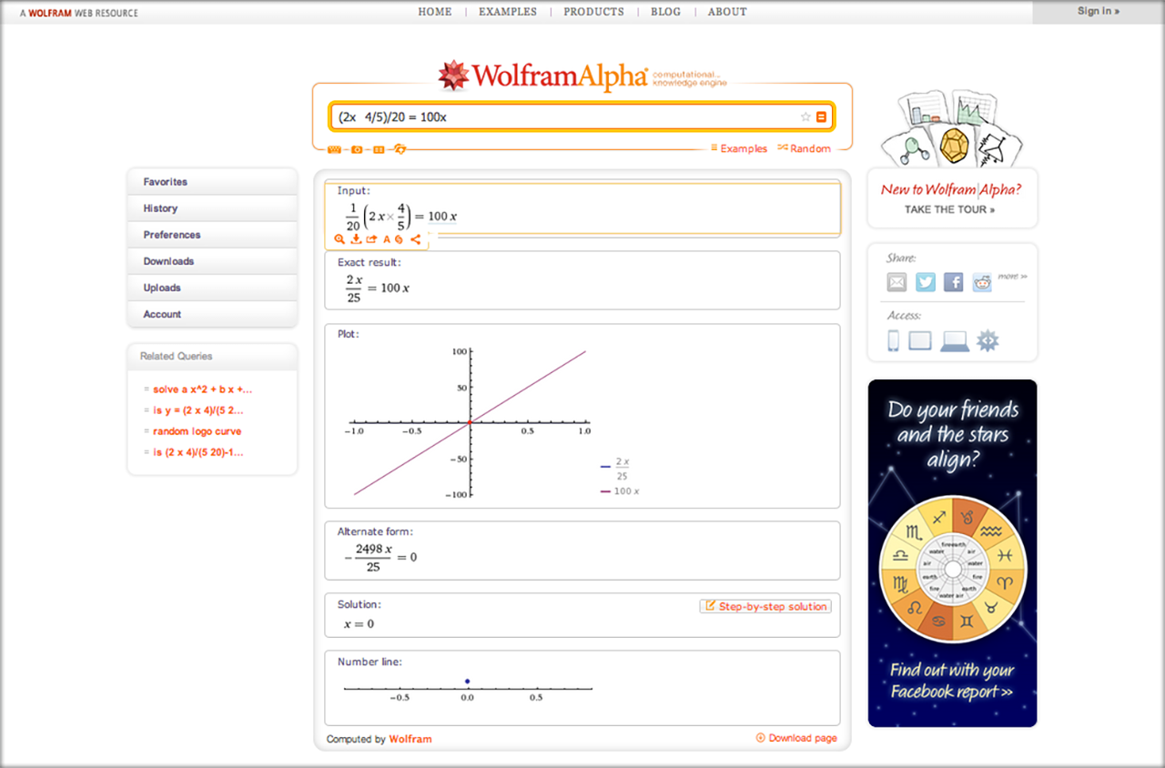
In developing my design, I considered what their existing page did not do at all. For example:
• How come there is only one equation / solution on the page? Since when is the answer to one question useful? Shouldn't the user be able to see side by side the questions?
• How could the website do a better job at getting the user to sign up for the paid service?
• How come there is no 'email this answer to me' or 'print this answer' button?
• What about integrations into mobile devices?
I identified the three key users on the site:
• Casual users - normal formula and board functionality is good enough.
• Power users - want access to power features and specialized apps. Maybe these are buried under a 'power tools' menu.
• Developers - these users don't need either of the above; instead, they want access to the APIs. Having a button: 'For Developers' is sufficient for them.
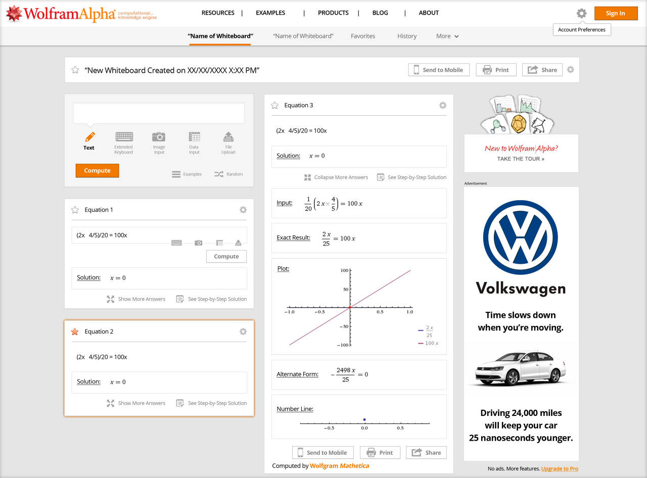
My Redesign:
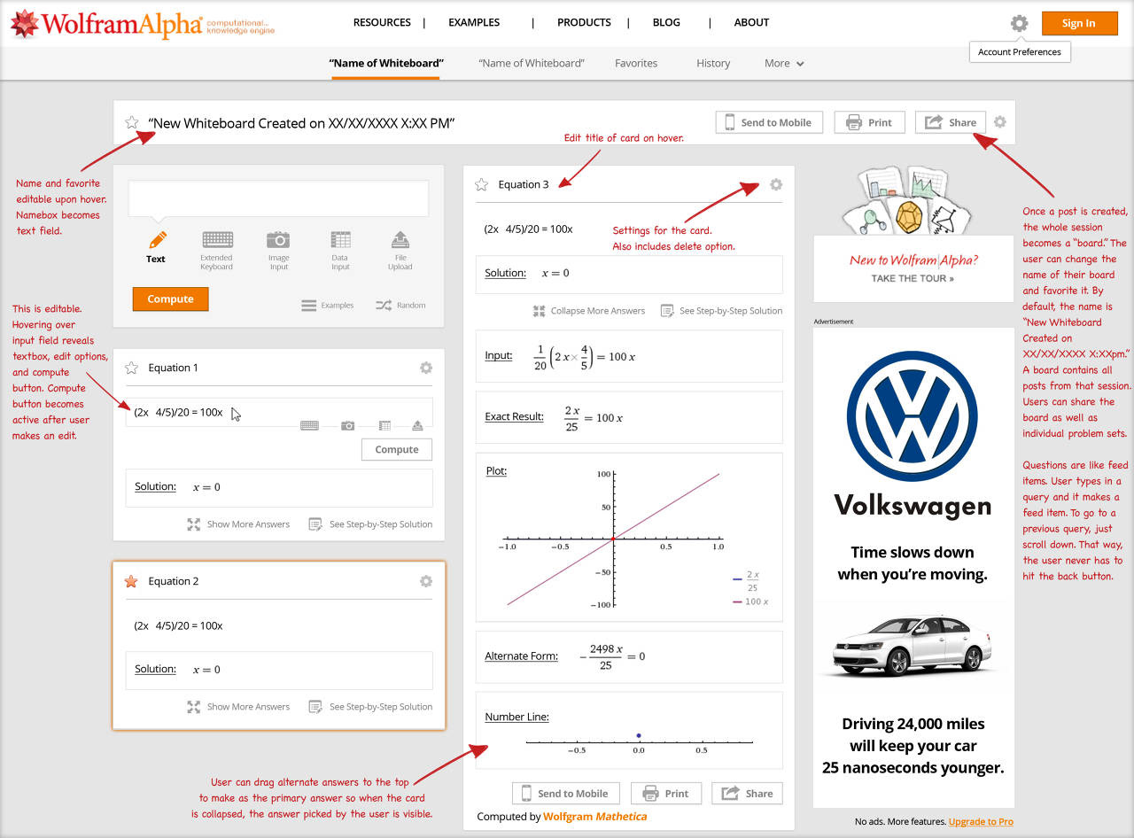
My Product Decisions:
In my design, users should be able to edit a formula / post instead of just making a new one. This functionality needs to be obvious, so the formula for the post should have its own input box.
At the same time, it allows a user to create a "whiteboard" from their session, compare problem sets, and share them, in an easy to understand, organized format.
I noticed Wolfram Alpha invests a lot of screen real estate trying to convert desktop users into mobile users, or at least inform people that it is available on mobile, which I thought could be done better.
Hence, in my comp, I integrated a "send session to mobile" button. All it would need is the user's phone number and it would send the user a text (or notification) which will open the session the user was on through their mobile device. On the mobile device, it can prompt the user to install the app. When the app installs, it can use the user's phone number to instantly remember which session to open to.
Questions should be like feed items. The user types a query and it becomes a feed item. If the user wants to go to a previous query, the user simply scrolls down the page. This way, the user never has to hit the back button.
On a desktop or tablet environment with a wide screen, the answers / feed items float side by side. This way, they are easily comparable. The layout I designed is meant to be done in a responsive fashion so that it can work on mobile.
I took a feature and expanded it into an end-to-end product.